Turn a Screenshot Into a Working App
Most people who have thought seriously about the software they wish their business had have experienced the same moment. You are in a product demo, or you are reading a blog post, or you are looking over a colleague's shoulder. On the screen is an interface that is exactly the right shape for your own team. A dashboard with the KPIs you care about. A project tracker with the stages your work actually goes through. A pricing page with the clarity you have been trying to produce for months.
In the moment, you notice three things almost simultaneously. First, that the interface would fit your business better than anything you currently use. Second, that it is somebody else's product — their data, their paywall, their brand. Third, that the distance between the screenshot and your own working tool is, for most people, the decision to call a developer, describe what you want, wait six weeks, and pay a quote that is five times what the idea felt like it was worth.
That last step is the one that has changed. The distance between "I wish we had something like that" and "we have something like that" is now, for a large set of cases, measured in minutes. Here is the walkthrough.
Why a screenshot is enough
A screenshot carries more information than most people realise. When you look at a well-designed interface, you are seeing a set of decisions that somebody already made. What fields belong on the primary view. How the user should navigate between sections. What counts as important enough to get a KPI tile. Where the filter bar sits. How the sections visually group. These are the decisions that take the longest when you build something from scratch. They are also the decisions that a screenshot has already made for you.
What a screenshot does not contain is your data or your business logic. It does not know which fields are relevant to your customers. It does not know which permissions your team needs. It does not know what happens when somebody clicks a button. These are yours to provide. The screenshot is the layout. You bring the rest.
This is also where the ethical line sits. The screenshot is inspiration for the shape of the tool, not a specification for cloning somebody's product. Copying the general layout of a dashboard that you saw in a demo is the same act as drawing inspiration from a competitor's pricing page when you redesign your own. It is a normal part of product work. Copying the specific brand, the specific copy, the specific logic, or the specific feature set of an identifiable product is not, and we treat that boundary seriously. The walkthrough below assumes you are on the right side of the line — using a screenshot to inform the shape of your own tool, for your own data, with your own brand.
The walkthrough, with real timestamps
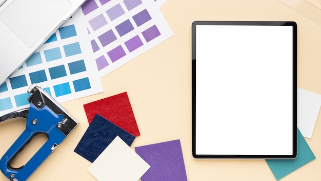
Our example is the classic case. You saw a polished internal CRM view in a product demo last week. It had a left-hand navigation with contact categories, a list view in the middle with inline tags, and a right-hand detail pane with activity history. You took a screenshot with the intention of "we should build something like this for our team".
0:00 — Take the screenshot. Anything that shows the interface clearly will do. A full-window capture is ideal. A phone photo of a screen will also work if the layout is legible.
0:30 — Upload the screenshot. Drag it onto the upload area. A small preview appears while the parser analyses the image.
2:00 — Exepad identifies the layout, fields, and structure. Every region of the screenshot is classified. The navigation panel on the left is recognised as a navigation panel. The list view is recognised as a list. The inline tags are recognised as categorical fields. The detail pane on the right is recognised as a detail view. A draft structure appears — here is what the parser thought the interface was doing.
3:00 — Describe your version. A single prompt. You type: "A CRM for a boutique agency. Contacts are categorised by relationship — Client, Prospect, Lapsed. Each contact has an activity history — emails, calls, meetings. Tag contacts by the service line they are interested in. Account managers see their own contacts; admins see all." This is where the layout inspiration meets your own business. The layout becomes yours.
4:30 — Review the generated app. A working version of the CRM appears. It follows the layout of the screenshot you uploaded but with your language, your categories, and your permissions. You click through to check that the navigation makes sense, that the list view shows the right columns, that the detail pane has the fields you described.
6:00 — Connect your data source. Three options. Upload an Excel or CSV of your existing contacts. Type a handful of contacts in to begin with. Or start completely empty and populate the CRM as new contacts arrive. Teams that already have a customer list usually take the first option — the import completes in thirty seconds and the CRM is already useful by the time you have refilled your coffee.
8:00 — Publish. The application is live at your own URL. You invite the team. The screenshot you took a week ago is now a working tool with your data in it.
What counts as inspiration versus copying
Because the line matters, it is worth spelling out. We encourage this walkthrough for the first kind of case and discourage it for the second.
Inspiration — the right use. A screenshot shows a layout you like. You rebuild the general shape of it — the navigation, the list-view structure, the KPI tiles, the sectioning — for your own business, your own data, and your own brand. What you end up with does not look like the source product except in layout logic. The users of your tool are your own team and your own customers. Nobody would confuse the two if shown both side by side.
Copying — the wrong use. A screenshot shows a specific product. You rebuild not just the layout but the brand, the copy, the specific feature flow, and the visual identity. You are not adapting the design language; you are reproducing someone else's product. This is a fast way to attract a legitimate complaint and an unhelpful outcome. It is also not what the walkthrough above is for. The output is always your own branded, your own worded, your own structured version.
If that line feels thin in a given case, the simplest test is whether the person whose screenshot you captured would recognise it as "inspired by my design" (fine) or "a copy of my product" (not fine). Most of the cases people care about are clearly in the first bucket.
Three practical examples
The walkthrough above used a CRM. The same shape of process fits many of the cases where "I saw it somewhere" has been the blocker for too long.
The pricing table. A small agency saw a rival's pricing page last month and immediately recognised that the three-tier layout, the anchor-priced middle tier, and the "talk to us" band for enterprise were the right shape for their own services. They took a screenshot. They published a pricing page with their own tiers, their own numbers, their own services, and their own brand. The layout logic came from the screenshot; the content was entirely theirs. Traffic to their pricing page tripled inside a month because the new page was actually legible.
The project tracker. A seven-person development studio had been using a shared spreadsheet to track projects across clients. They saw a project tracker in a Medium post last quarter that had exactly the stages they wanted — Inbound, Scoping, Active, Review, Billable. They took a screenshot. They published their own project tracker with the same stages and their own project data. The shared spreadsheet retired the same day.
The portfolio site. An independent photographer was stuck on portfolio design — every template felt generic, every bespoke quote was too expensive. They found a peer's portfolio they admired, took a screenshot, and used the layout as the starting point for their own site with their own photos, their own wording, and their own colour palette. The published site looks nothing like the source. The structural decisions came from the screenshot; the work did not.
Getting started
If you have a screenshot in your phone right now that you have been meaning to do something with, the fastest way to find out what happens is to upload it. The output is a draft, not a commitment. You can iterate on it, invite colleagues to look, and decide whether to publish it for real.
If the output you want is a digital form rather than a full application — because the original interface was a paper form or a single-screen input — the image-to-form walkthrough is the closer match. If the starting point is a spreadsheet rather than an image, the Excel-to-app walkthrough covers that starting point directly.
The tool page, with examples of apps built from screenshots and a short video of the process, is at /convert-image-to-app.